เขียนโดย: Naoto Fukasawa
แปลสรุปความโดย: ชานนท์ เกษมวรรรกร รหัสนักศึกษา 5211310015 กลุ่มเรียน 102
Contact E-mail : janonkas@gmail.com
Publish Blog: http://janonkas.blogspot.com/
แปลสรุปความโดย: ชานนท์ เกษมวรรรกร รหัสนักศึกษา 5211310015 กลุ่มเรียน 102
Contact E-mail : janonkas@gmail.com
Publish Blog: http://janonkas.blogspot.com/
รายวิชา: Arti3314 การออกแบบกราฟิกสำหรับบรรจุภัณฑ์
วันที่ส่ง: 20 มิถุนายน 2554
วันที่ส่ง: 20 มิถุนายน 2554
ที่มารูป http://www.toxel.com/wp-content/uploads/2009/03/juicepackaging01.jpg
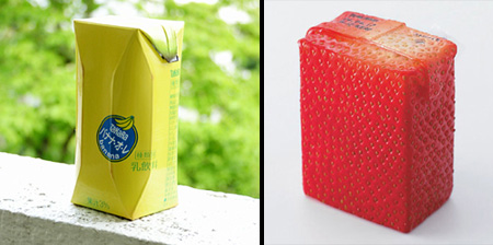
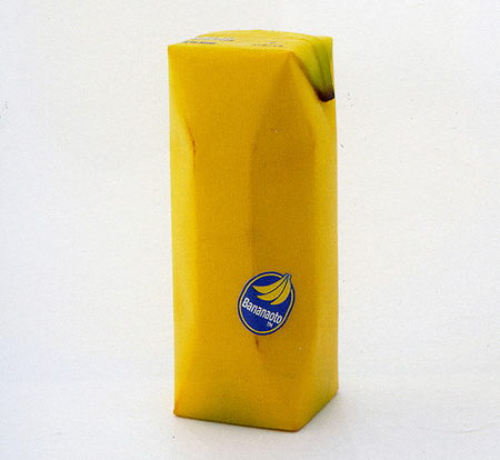
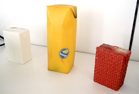
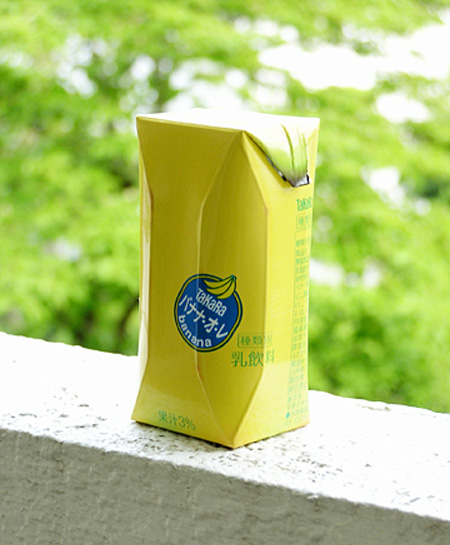
นักออกแบบอุตสาหกรรมญี่ปุ่นNaoto Fukasawaได้สร้างชุดของแพคเกจน้ำผลไม้ที่มีความคิดสร้างสรรค์มองและความรู้สึกของผลไม้พวกเขา
ที่มารูป http://www.toxel.com/wp-content/uploads/2009/03/juicepackaging01.jpg
“I imagined that if the surface of the package imitated the colour and texture of the fruit skin, then the object would reproduce the feeling of the real skin.”
"ผมคิดว่าหากพื้นผิวของแพคเกจเลียนแบบสีและเนื้อสัมผัสของผิวผลไม้แล้ววัตถุที่จะทำซ้ำความรู้สึกของผิวจริง."


ที่มารูป http://www.toxel.com/wp-content/uploads/2009/03/juicepackaging01.jpg
banana, strawberry and kiwi fruit “juice skins” Naoto Fukasawa also offers a wild card “silken tofu skin” for a carton of soya milk.พร้อมกับกล้วยหอมสตรอเบอร์รี่และกีวีผลไม้"กินผลไม้"Naoto Fukasawa ยังมีป่าการ์ด"ผิวอ่อนนุ่มเต้าหู้"สำหรับการบรรจุภัณฑ์ของนมถั่วเหลือ
ที่มารูป http://www.toxel.com/wp-content/uploads/2009/03/juicepackaging02.jpgAlongside
บรรจุภัณฑ์สวยๆ กับผลิตภัณฑ์จากนม Daily Dairy สีเหลืองสดใส :D ;D
ออกแบบบรรจุภัณฑ์ Doritos Packaging Concept
เขียนโดย: Naoto Fukasawa
แปลสรุปความโดย: ชานนท์ เกษมวรรรกร รหัสนักศึกษา 5211310015 กลุ่มเรียน 102
Contact E-mail : janonkas@gmail.com
Contact E-mail : janonkas@gmail.com
รายวิชา: Arti3314 การออกแบบกราฟิกสำหรับบรรจุภัณฑ์
วันที่ส่ง: 20 มิถุนายน 2554
Doritos Packaging Concept This project was based on one of the YCN briefs where they asked from designers to create a totally new packaging concept for Doritos. Unfortunately, when I saw the brief the deadline was very close, but nevertheless I developed it. โครงการนี้มาจากหนึ่งในกางเกง YCN ที่พวกเขาถามจากนักออกแบบเพื่อสร้างแนวคิดบรรจุภัณฑ์ใหม่ ๆ ออกมาเป็น Doritos แต่เมื่อผมเห็นกำหนดเวลาที่สั้นมาก แต่ผมยังคงพัฒนามัน รูปร่างและพื้นผิวของ Doritos จะใช้ชิปเป็นหลัก เพื่อเป็นแนวคิดของบรรจุภัณฑ์นี้   What's good about the form of the packaging is its structure which can keep the chips closed after opening. Below you can see a scaled-down model of how this works. สิ่งที่ดีเกี่ยวกับรูปแบบของบรรจุภัณฑ์ที่เป็นโครงสร้างซึ่งสามารถเก็บชิปปิดหลังจากเปิดใช้แล้ว คุณสามารถดู รูปแบบการลดขนาดลงของแบบว่ามีการทำงานอย่างไร   Currently I'm developing illustrations which can replace the textured solid colors. I also invite every designer interested in collaboration to create artworks of his own.ปัจจุบันผมพัฒนาภาพประกอบที่สามารถแทนที่เป็นพื้นผิวสีทึบ ฉันยังขอเชิญชวนนักออกแบบที่สนใจในมาทำงานร่วมกันเพื่อสร้างผลงานศิลปะของเขาเองทุกครั้ง คุณสามรถดูอาร์ทเวิร์ดและแสดงความคิดเห็นได้ในกลุ่มบนเฟสบุค group: http://bit.ly/tQvpU คุณสามารถดาว์โหลดเทมเพลทของบรรจุภัณฑ์นี้ได้ที่ (http://bit.ly/rGY2V) ซึ่งประกอบด้วยสองเลเยอร์ เป็นไฟล์psd อาร์เวิร์คพร้อมให้คุณใช้ ผมหวังว่าคุณจะชอบมันเมื่อคุณเห็น   credit: behance.net |
PDATE:
The Croatian Design Society organized a workshop for children aged 7-14 years where they were given the task to create artworks for this packaging. It is a great honor to be part of this and see the way these young designers think. I would like to thank to Izvorka Juric for organizing this.
Here are some photos from the workshop:
r children aged 7-14 years where they were given the task to create artworks for this packaging. It is a great honor to be part of this and see the way these young designers think. I would like to thank to Izvorka Juric for organizing this.
Here are some photos from the workshop:
ทางโครเอเชียออกแบบสังคมจัดอบรมเชิงปฏิบัติการสำหรับเด็กอายุ 7-14 ปีที่พวกเขาได้รับงานในการสร้างงานศิลปะสำหรับบรรจุภัณฑ์นี้ มันเป็นเกียรติอย่างยิ่งที่จะเป็นส่วนหนึ่งในการทำงานด้านนี้และเพื่อเป็นแนวทางของนักออกแบบรุ่นเยาว์อีกด้วยผมอยากจะขอบคุณคุณ IzvorkaJuric สำหรับการจัดงานครั้งนี้
นี่คือภาพบางส่วนในการทำworkshop ของเด็กๆ
Photo Credit: Dragana Iles, HDD
Leon Bokun, 12 years
Lovro Baletic, 11 years
บรรจุภัณฑ์จากนม Daily Dairy สีเหลืองสดใส :D ;D
เขียนโดย: Kim Hei Ip
แปลสรุปความโดย: ชานนท์ เกษมวรรรกร รหัสนักศึกษา 5211310015 กลุ่มเรียน 102
Contact E-mail : janonkas@gmail.com
Contact E-mail : janonkas@gmail.com
รายวิชา: Arti3314 การออกแบบกราฟิกสำหรับบรรจุภัณฑ์
วันที่ส่ง: 20 มิถุนายน 2554
บรรจุภัณฑ์สวยๆ กับผลิตภัณฑ์จากนม Daily Dairy สีเหลืองสดใส :D ;D
 บรรจุภัณฑ์น่ารักๆสีเหลืองสดใสกับผลิตภัณฑ์จากนม Daily Dairy จากผลงานการออกแบบบรรจุภัณฑ์ของ Kim Hei Ip โดยตัวโลโก้ (Logo) นั้นเขาได้ใช้ตัว “D” จากคำว่า Daily Dairy โดยนำเอามาทำเป็น Symbol คือ :D และ ;D ซึ่งสื่อให้เห็นถึงความมีความสุขสดใสและการมีสุขภาพดีนั่นเอง สามารถดูรูปบรรจุภัณฑ์น่ารักๆกับกับผลิตภัณฑ์จากนม Daily Dairy โดนผลงานการออกแบบบรจุภัณฑ์ของ Kim Hei Ip เพิ่มเติมด้านล่างครับ…     credit: http://www.bunjupun.com/archives/3284 |
PDATE:
The Croatian Design Society organized a workshop for children aged 7-14 years where they were given the task to create artworks for this packaging. It is a great honor to be part of this and see the way these young designers think. I would like to thank to Izvorka Juric for organizing this.
Here are some photos from the workshop:
r children aged 7-14 years where they were given the task to create artworks for this packaging. It is a great honor to be part of this and see the way these young designers think. I would like to thank to Izvorka Juric for organizing this.
Here are some photos from the workshop:
ทางโครเอเชียออกแบบสังคมจัดอบรมเชิงปฏิบัติการสำหรับเด็กอายุ 7-14 ปีที่พวกเขาได้รับงานในการสร้างงานศิลปะสำหรับบรรจุภัณฑ์นี้ มันเป็นเกียรติอย่างยิ่งที่จะเป็นส่วนหนึ่งในการทำงานด้านนี้และเพื่อเป็นแนวทางของนักออกแบบรุ่นเยาว์อีกด้วยผมอยากจะขอบคุณคุณ IzvorkaJuric สำหรับการจัดงานครั้งนี้
The Croatian Design Society organized a workshop for children aged 7-14 years where they were given the task to create artworks for this packaging. It is a great honor to be part of this and see the way these young designers think. I would like to thank to Izvorka Juric for organizing this.
Here are some photos from the workshop:
r children aged 7-14 years where they were given the task to create artworks for this packaging. It is a great honor to be part of this and see the way these young designers think. I would like to thank to Izvorka Juric for organizing this.
Here are some photos from the workshop:
ทางโครเอเชียออกแบบสังคมจัดอบรมเชิงปฏิบัติการสำหรับเด็กอายุ 7-14 ปีที่พวกเขาได้รับงานในการสร้างงานศิลปะสำหรับบรรจุภัณฑ์นี้ มันเป็นเกียรติอย่างยิ่งที่จะเป็นส่วนหนึ่งในการทำงานด้านนี้และเพื่อเป็นแนวทางของนักออกแบบรุ่นเยาว์อีกด้วยผมอยากจะขอบคุณคุณ IzvorkaJuric สำหรับการจัดงานครั้งนี้
นี่คือภาพบางส่วนในการทำworkshopของเด็กๆ
Photo Credit: Dragana Iles, HDD
Leon Bokun, 12 years
Lovro Baletic, 11 years